Chef Brand
The Chef logo means a lot of things to a lot of people. It is an emblem championing open source software and its community. It is a seal of quality and a stamp of approval from the company. Therefore it should be used proudly, consistently, and with great meaning.
The stacked Chef logo
A stacked version of the brandmark may be used when space limitations do not permit correct use of the primary horizontal version.
Positioning
Preferably the logo should be left aligned because of the alignment of the components in it.
Minimum size
To avoid poor reproduction on screen and print, the brandmark should appear no smaller than 110px or 1 inch in height.
The Progress Symbol
For use when space limitations do not permit correct use of the primary horizontal or stacked versions.
Clear Space
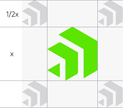
The symbol has a clear space based on 1/2 of the size of the symbol. To avoid poor reproduction onscreen and in print, the logo should appear no smaller than 14px or 0.25 inches in height. It should never appear in any color other than our logo green
Colors
Progress® Chef® Logo Green
RGB 92.229.0
HEX #5CE500
CMYK 46.0.90.0
PMS 375
Progress® Chef® Logo Gray
RGB 75.78.82
HEX #4B4E52
CMYK 40.20.20.75
PMS Cool Gray 11
Progress® Chef® Logo Black
RGB 25.25.25
HEX #191919
CMYK 50.50.50.100
Clear Space
The product brandmark has a clear space to prevent it from being crowded by other visual elements. The clear space is based on 1/2 of the Progress Symbol.


